Mapknitter annotations GSoC
What I want to do
There is no single page to find all the work we’ve done thinking about map annotations. I want to summarize the map annotation needs of our community, work thus far, and provide examples.
Work to Date
Public Lab has invested some development and discussion time in map annotation. Here is our 2013 Winter Camp brainstorming session. And a 2012 brainstorm..
Work progressed on a Leaflet-based annotation system that is not currently running in Mapknitter. It can do polygons and Google-style pins. The server code for the Annotation Controller is here. and the client-side Javascript is here.. Issues with that system are discussed in Github here.
Examples of Annotation
Currently, annotated maps using online interfaces are kind of crumby. It is easy to do something like this:
but lots of pins and labels turn into a completely unreadable mess. Historically, people have written text at a variety of angles, at scale:
[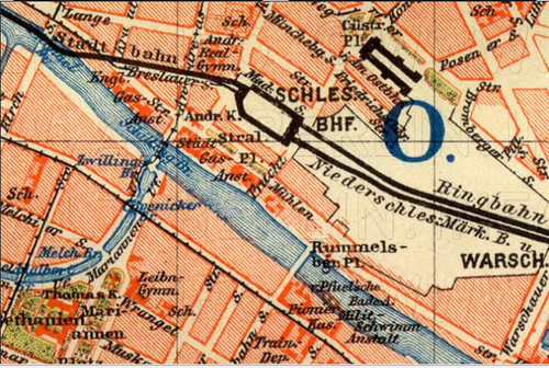
BERLIN, F.A. Brockhaus´ Geographisch-artistische Anstalt, Leipzig 1895, Wikimedia Commons
Unfortunately, there is no way to place text on a map and lock it to a specific location, rotation, and scale, even though that is the most obvious and intuitive way to present information on a map. So most Public Lab community members add text either in a pro GIS program, Adobe Suite, or, most likely, in Powerpoint. Powerpoint is actually awesome at this.
 From Eustatic’s note on annotations:
-
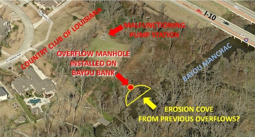
Note that the text is not in bubbles, but generally a yellow, red, or orange color to contrast with the browns and greys of the forested landscape.
-
Note the use of arrows and dots.
-
Note the white underneath the text that is unclear.
-
Whether or not this map was drawn in microsoft paint (or equiv. apple software) it is something that can be drawn in these widely available formats.
-
This aesthetic of “text directly on image” is something that has been done since photography began.
Eymund does a lot of Paint/Powerpont annotations as well:
[
Also take a look at Hagit Kaysar’s work using Adobe tools and wonderful writeup and Gina Wirth’s work in ArcGIS. While using more complicated tools, these are beautiful, well thought out, and aesthetic examples.
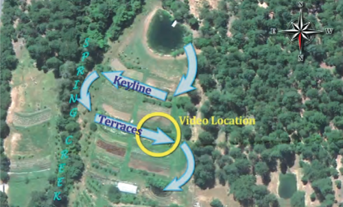
Here is a non-public lab example using powerpoint, from Andrew Millison (video link) Andrew uses lots of arrows and text to explain the motion of water. These are the sorts of annotations we want to encourage.
Questions and next steps
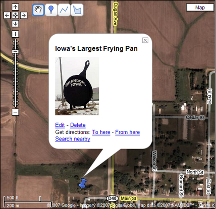
As a sort of minimal feature set it would be wonderful to add arrows, dots, and text in different colors and angles, locked to the map scale, like this:
A mock-up made by Liz
embedding images or video, or linking to notes would also be very useful. This would help people situate maps within a narrative.
Why I’m interested
In the Public Lab Archive it is hard to see why a map is being made, and to collaboratively embed observations into maps. These sorts of annotations are how Grassroots Mapping maps are usually presented in public, but these low-res, powerpoint modified maps rarely make it back to the Public Lab community. I would like to see this process simplified and built around sharing.
Archived 4th of March 2018 from Publiclab.org.